Emprise Bank rebrands its Wichita headquarters, branches
Goal was to modernize the bank’s exterior presentation to match the quality of experience found inside
Emprise Bank is family-owned with 37 branches across Kansas. This project began as a rebranding effort that included the core of the bank’s identity: its logo.
The Luminous team provided value at many levels. The design team offered multiple design packages, prototypes and production methods to provide maximum value and ensure customer satisfaction.
“Luminous brought us a recommendation on how to improve visibility for our sign package at night, as well,” said Jeff Faflick, vice president of marketing.”
Faflick and Luminous collaborated on a design that incorporated a perforated sign face that displays the bank’s signature blue in the day but turns white at night by allowing illumination to shine through.
“With the new signage, we were able to create an atmosphere outside that was representative of the experience inside.”
Faflick said the outcome of the project justified his decision to work with Luminous.
“We always consider Luminous to be at the top of the list when it comes time to alter or modify the decor of our facilities.”


Other News

Jeans for a Cause
Donations for Denim Luminous Neon employees work to support their communities by wearing jeans Luminous Neon employees have been making an impact on their communities monthly all by wearing jeans. For a [...]
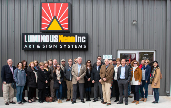
Seventh Location Added for Luminous Neon
Luminous Neon is in Wichita Luminous Neon Art & Sign Systems opens a new office location to better serve the Wichita metro area. Thanks to the excellent staff at Wichita Regional Chamber of [...]
Luminous signs earn Gold, Silver awards in 2018 Watchfire contest
Luminous Honored Five Times in 2018 Watchfire LED Sign Awards Businesses reach customers with LED digital signs July 12, 2018 -- Five electronic message center (EMC) digital signs from Luminous were honored in the 2018 Watchfire [...]

TSSA scholarships awarded to Luminous families
TSSA announces 2018 scholarship winners Seven children of LNI employees were selected to receive college scholarship from the Tri-State Sign Association. This year there were 32 recipients of the Gene Russell Scholarship from Kansas, [...]